Show Posts

This section allows you to view all posts made by this member. Note that you can only see posts made in areas you currently have access to.


Messages - Anonymous

Pages: [1]
1
Hello Mathias,

I have found this fitting posting:

http://forum.multicommander.com/forum/index.php/topic,393.msg1056.html#msg1056

How far is the progress on this?

Whereby I still prefer the ghosted/greyed out hidden/system files, folders and icons, would be much more nicer than just coloring the font.

2
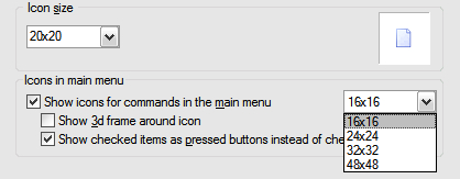
Thank you, that are good news. I have already tested the medium 24x24 size with another file manager where is is possible to choose both from fixed sizes and also define a custom icon size for files and folders; and fixed sizes for the top bar icons (16x16-48x48) and can confirm that there is no quality loss or contortions - even with non standard icon sizes as 20x20 or 22x22.

So it would be yet better if you could allow for the file and folder icons additional to the fixed standard sizes also to enter custom sizes as 20x20 or 22x22.


3
Please add also medium icon size (24x24) for file and folder icons in explorer panel settings -> layout -> icons -> icon size
In my opinion the small size (16x16) is a little bit too small and the big size (32x32) is too big, whereas the medium size (24x24) is optimal.

4
It would be nice, if it would be possible to show the top menu bar icons not only in small (16x16) but also in medium (24x24) and big size (32x32), at best changeable by right click directly on the bar.


5
1. How can I show the extension of files directly after the filenames INSTEAD of showing them in the extension column?
2. Is it possible to show BOTH the extension directly after the filnamen and additionally in the extension column?

6
I would like to have the opportunity in the configuration menu to choose how many rows I want to have displayed in the button window and that by standard only the first button row with the F-keys should be displayed.
Especially on 16" widescreen notebook displays too much space is wasted with the big button window and in my opinion the other three rows are not necessary.


Besides it is a little bit inconvenient to have to edit a configuration file in order to achieve that.

http://forum.multicommander.com/forum/index.php/topic,273.msg380.html#msg380

7
I miss the option (should be activated in standard) to show the hidden/system files and folder (incl. icons) ghosted/greyed out and/or at least in another color.

8
Thank you, I also had to activate "overrider standard windows background",  then it worked.
BTW should it not be called override (spelling fault)?

9
I miss the option (should be activated in standard) to show the hidden/system files and folder (incl. icons) ghosted/greyed out and/or at least in another color.

10
Hello,

it would be very useful, if you could offer the opportunity to make the background of every second line in another color, for example light grey or light blue, so that it would look like white-light grey-white respectively white-light blue-white etc.

Pages: [1]